Canculator: helping immigrants in Canada track their journey to citizenship

Initial UX Review
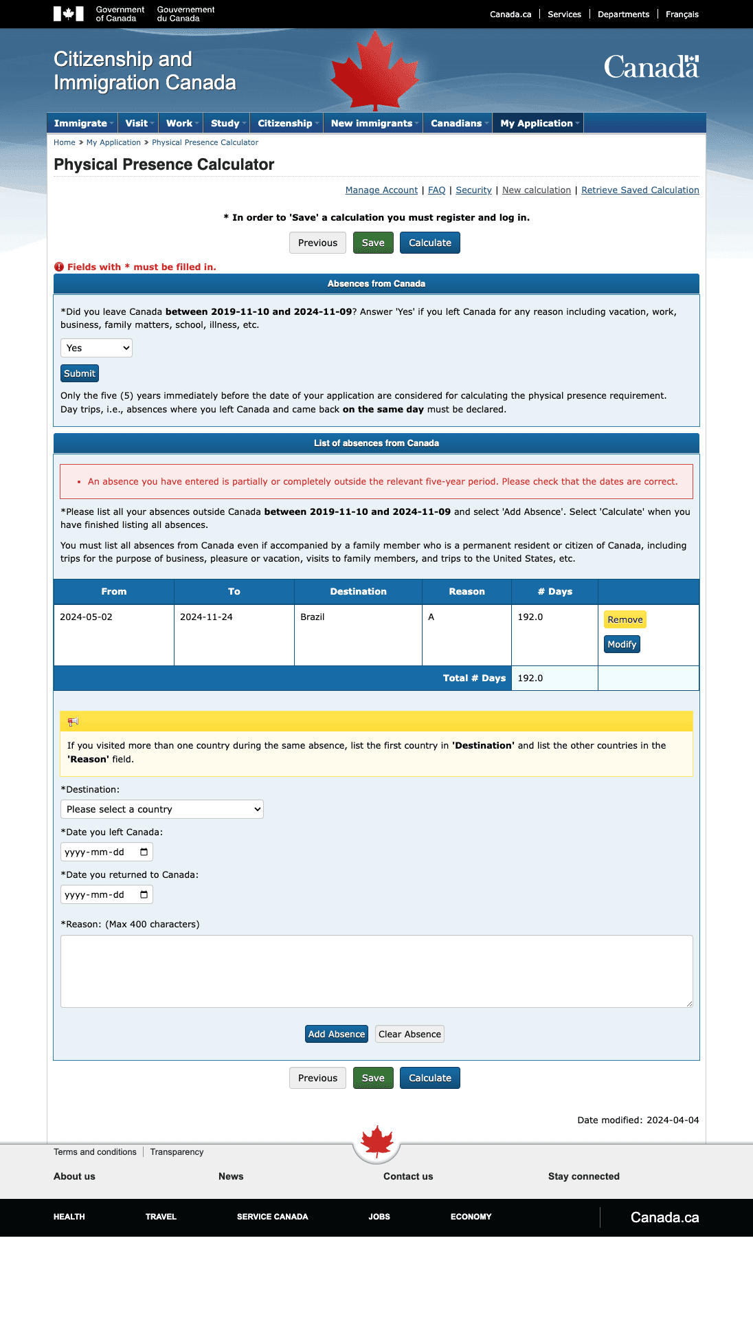
Visual hierarchy and layout
There’s a lack of visual hierarchy, which makes it hard to know where to start. Headers could be larger, and important sections could use color or other styling to stand out.
Spacing between sections is minimal, making it feel cramped. Increasing the spacing and adding separators between sections would improve readability and the overall structure.
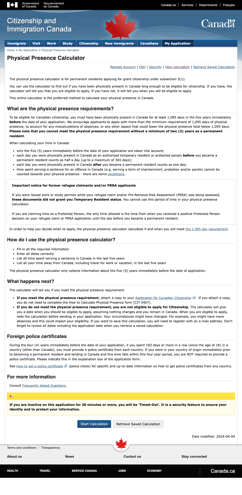
Dense Text and Information Overload
Landing page contains long blocks of text without much separation or visual hierarchy, which can be overwhelming and hard to scan. Breaking up the information with bullet points, collapsible sections, or icons would improve readability.
Important information, like the "1,095-day requirement", is buried in the text. This could be emphasized more clearly.
Mobile Responsiveness
Although the design is responsive, there are some flaws to its implementation, where excessive text, lack of visual hierarchy and a better content strategy.
There are opportunities specially on how negative space is used here. Content density is too high.

Sequence of flow is confusing
Although the page explains what data users need to enter, it could benefit from visual examples or tooltips next to each instruction. This would make it clearer, especially for people who may not be familiar with the process.
Having form fields directly on the page with dynamic instructions as the user fills them out could make it more interactive and reduce confusion.

UI could be more polished
The current state of the UI presents many areas for improvements including credibility, accessibility, consistency, clarity and focus.
In many moments users are overwhelmed with unpolished components, inconsistency on how information is displayed and lack of aesthetic appeal – not inviting users to explore and finish this long flow.

Excessive amount of text
Government tools tend to be excessive on how they present information and instructions, potentially slowing down task completion, makes key information harder to find, and can frustrate users – aside from increasing cognitive load.
I believe the use of images, icons can reduce the amount of text and also improve scan-ability overall.
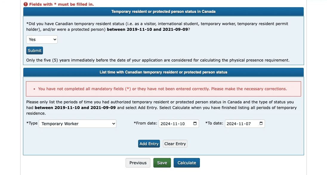
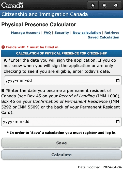
Dates are not user friendly
Dates are displayed in a format that is hard to read at first, making users connect numbers to a specific month. This becomes specially more complex when immigrants are not used to how they learned how to write and read date formats.
It's common for countries outside of North America to read 11-01-2024 as "January 11th, 2024" as oppose to "November 1st, 2024".

Date picker prone to user error
There is a change to avoid user error by limiting date range to specific time window.
Since the government expects your calculation to happen in the past 5 years, the system fails to limit that, allowing dates to be picked outside of the range, potentially causing user errors.

Unnecessary mandatory fields
The system requires users to add information that is not important to them at the moment of calculating a preview of their citizenship journey.
For example, when you're absent, the system expect a reason – although valid for the citizenship process, this is not relevant before actually applying for a citizenship.
Confusing CTAs
CTAs are crucial to guide and keep users in the flow, sometimes exposing what's next.
The system uses generic CTAs in all screens, for example "Calculate" is used many steps before actually calculating your physical presence. Something like "Continue" or "Procede to [phase name]" is more appropriate for a multi-step flow.
Why going mobile

Better performance
Although it's a simple idea, and would not require a lot of computing performance, using a mobile device for the solution will help specially on keeping the data offline, allowing users to add and manage their physical presence without an internet connection.

Enhanced features
A mobile app would be specially helpful with the physical presence calculator by using the FPS feature on a smartphone – allowing users to keep track of their absence from Canada automatically, in case they decide to leave the country.

Engagement
Push notifications can be helpful to either remind users to add missing information or even celebrate milestones or let them know they can start their citizenship application when available – the ultimate goal.

Improved UX
Mobile devices offer a easier to use interface and interactive components such as date pickers, text inputs and navigation. Another benefit of a small device is how the solution can focus on doing one task at a time.

Companion through the years
The journey of becoming a Canadian Citizenship is nothing but short. It requires a lot of effort and many years. Having a mobile app can be the support they need through the years – for the reasons listed above.

Sync in cloud
Every mobile user needs an email account to get the device working. The ability to have easy access to that will help keep the data in the cloud in case users change phones or loose access to them.
Design iterations
Simpler approach
Real time data
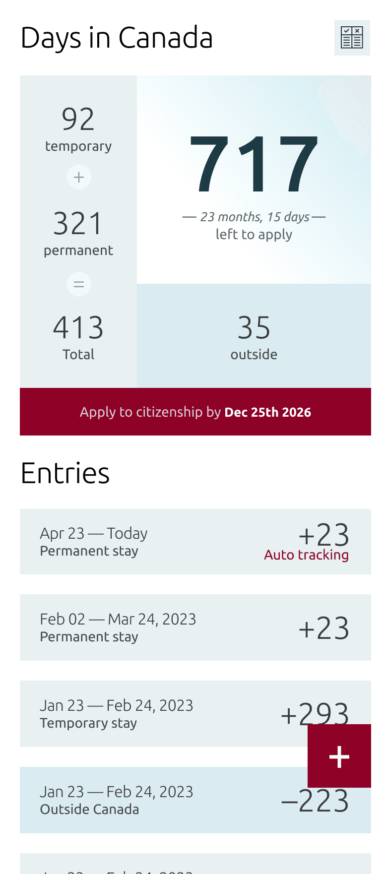
Using Firebase, information can be stored in the cloud, so with just a tap, users can check how they're progress is going, as oppose to opening a website, logging in every time and going through multiple steps to retrieve their information.
Easy calculation
Every new date period entry, the app will calculate in real time and provide an application date, making it more effective and reducing the amount of steps users have to do it today (they have to skip rigged steps in the flow).

Onboarding
The current experience provides a extremely detailed and text heavy onboarding. The idea is to use images and icons to reduce the amount of text and simplify the language, making it more user friendly and easier to digest (specially for immigrants with english as their second language).
Animation as feedback
Animation here is used to provide a feedback of their recent actions (adding, editing or deleting date periods). It's a nicer way to provide real time information, making the app more engaging and fun.
Easy edits
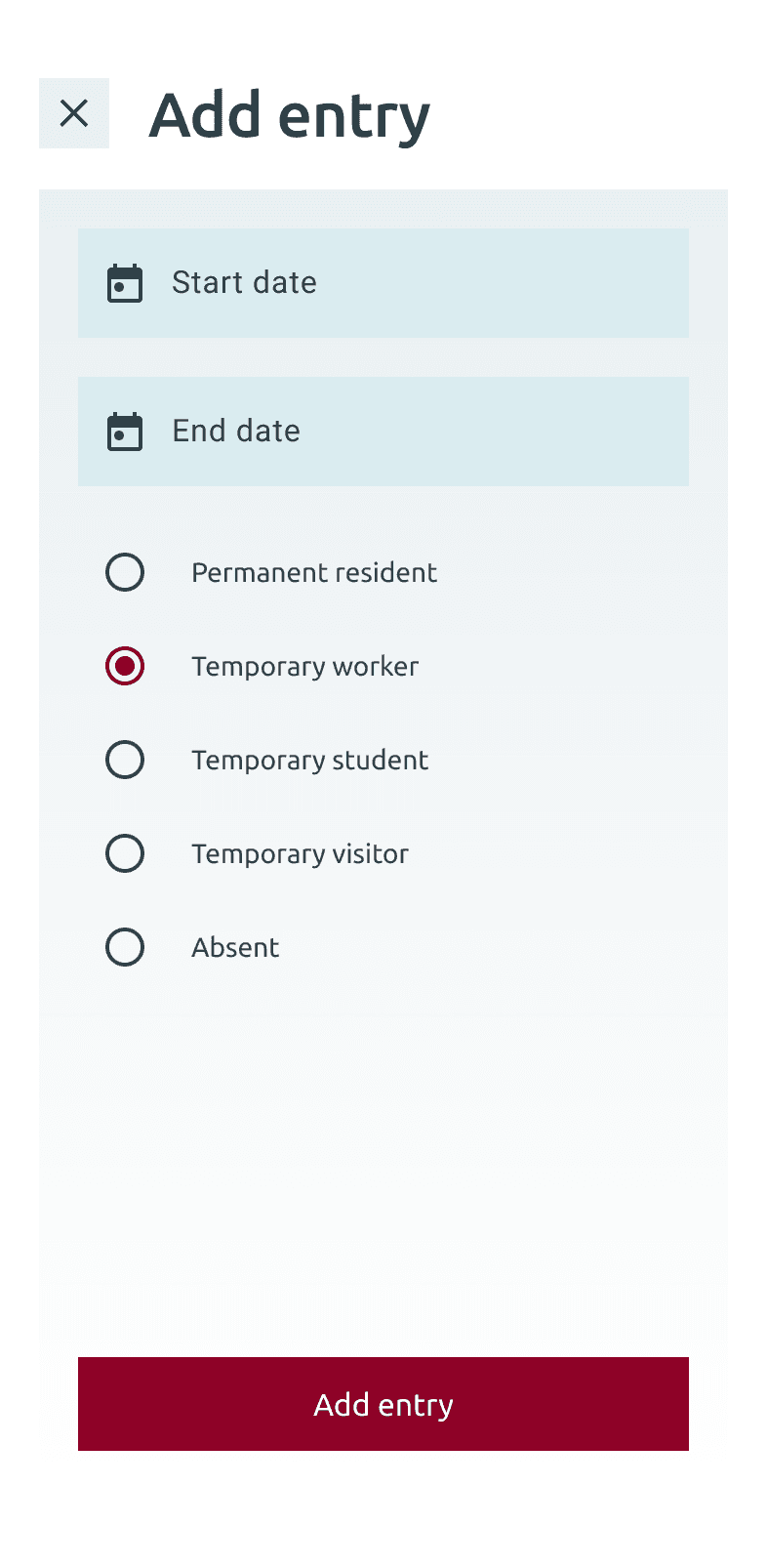
Editing a date period requires only one touch. More accessible, easier to tap and interact date pickers make this feature even simpler and friendlier.
Developing in Flutter
Why
Although it's a simple idea, and would not require a lot of computing performance, using a mobile device for the solution will help specially on keeping the data offline, allowing users to add and manage their physical presence without an internet connection.
Serveless
A mobile app would be specially helpful with the physical presence calculator by using the FPS feature on a smartphone – allowing users to keep track of their absence from Canada automatically, in case they decide to leave the country.
Better performance
Although it's a simple idea, and would not require a lot of computing performance, using a mobile device for the solution will help specially on keeping the data offline, allowing users to add and manage their physical presence without an internet connection.
Next steps
Why
Although it's a simple idea, and would not require a lot of computing performance, using a mobile device for the solution will help specially on keeping the data offline, allowing users to add and manage their physical presence without an internet connection.
Serveless
A mobile app would be specially helpful with the physical presence calculator by using the FPS feature on a smartphone – allowing users to keep track of their absence from Canada automatically, in case they decide to leave the country.